Few things can stimulate group health like genuine prayer and fasting by the leader prior to the group meeting. Dave Earley

Few things can stimulate group health like genuine prayer and fasting by the leader prior to the group meeting. Dave Earley


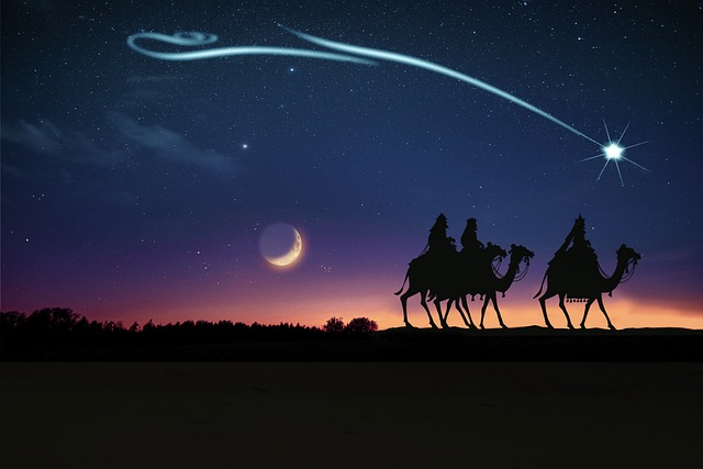
The sermon for January 7th 2023 is now available on the new Life web site.
In this sermon, which is based on Matthew 2:1-12, i talk about Wisdom and Worship.
Click here to download or listen in your browser.
From Wattsupwiththat.com, Willie Eschenbach talks about the Living Planet Index
A few years back, some scientists got together and invented something they call the Living Planet Index, or LPI. It’s supposed to measure how well (or poorly) the species that make up the living world are doing. They say it is a “measure of the state of the world’s biological diversity based on population trends of vertebrate species.” So it’s an index based on the decline of some selected species, which is claimed to represent the decline of the species of the “living world”.
Here’s the big news from their latest report.
The Living Planet Index claims an average 70% decline in the populations of species worldwide since 1970.

YIKES! 70% loss since 1970! EVERYONE PANIC!
But is this true?
Over in the Twitterverse where I’m @weschenbach, I said that based solely on my experience, their claim was nonsense. I’ve spent a lot of the last half-century outdoors in the elements, both on land and on and under the sea, around the planet. I said I would have noticed a 70% reduction in species populations.
Of course, folks who spend their lives behind desks in a city thought I was being ridiculous, and they laughed uproariously. How could I be so certain? Plus of course, there were the claims of “But Willis, those are actual scientists! How can you doubt them?”
So I thought I’d take a look at some real data. Let’s get a sense of the number of the species involved.
There are estimated to be around 8.7 million species on earth. Of these, about 65,000 are vertebrates.
How many of these 8.7 million species are studied by the Living Planet Index? Well, not all of them.
First, no plants, no fungi, no chromista. Next, only vertebrates, and only some of those, specifically fish, mammals, birds, reptiles, and amphibians.
The good news is that the IUCN Red List of Threatened Species, which is the official keeper of data on which species are threatened or not, lists data for 62,493 vertebrates, so it covers pretty much all of the vertebrates.
It also allows us to search based on various criteria, including those used by the LPI listed above.
And when we eliminate the vertebrate species the LPI doesn’t include, we end up with 59,866 species fitting the LPI criteria—mammals, birds, reptiles, fish, and amphibians. Of course, they didn’t look at all of them, only 5,230. But I wanted a larger view of the issues.
The Red List also lets us see if the populations of each species are increasing, stable, or decreasing.
Of the populations of the 30,763 of the LPI-studied mammal etc. species for which the Red List has population data, 53% have stable or increasing populations. So we’re left with 14,565 species with decreasing populations. Call it half to be generous.
Here’s the problem. If around half the species for which we have data are stable or increasing, then even if the rest were all totally extinct, the average decline would only be 50% … far from the 70% they claim.
Oooops …
Next, as a sensitivity analysis, let’s assume every one of the 28,714 species for which we don’t have the population trend is decreasing. Clearly, that’s not possible—some will be increasing or stable. And because the Red List is focused on threatened species, the unknown species will likely be weighted towards stable species. But it’s a sensitivity analysis, so we’ll assume every one of the unmeasured species is decreasing.
With that impossible assumption purely for a sensitivity analysis, it would mean only 27% of the species are stable or increasing.
And the problem still remains. With 27% not decreasing, the only way to get to a 70% decrease in population is if almost every one of the 33,861 theoretically decreasing species is already extinct or on the brink of extinction. Only that impossible situation would give us a 70% average decrease.
Conclusions?
Out of 59,866 species fitting the LPI criteria for which we have population data, just over half are stable or increasing.
Of the 59,866 species, only 8,509 are both decreasing and in some trouble (vulnerable or near threatened or endangered or critically endangered). Here’s the Red List Report:

The endangered and decreasing fish, birds, reptiles, amphibians, and mammals are 0.001% of all species, and there’s no reason to assume that their condition reflects the world situation.
The 70% claim of the LPI is falsified by the Red List data.
As I said, I have investigated this because based solely on my experience, I said I didn’t believe the LPI numbers, and folks laughed at that. And now, having studied the species data, I find that my experience is correct—their claims don’t hold water.
So how did the scientists behind the LPI get it so wrong? Obviously, their selected species are not representative of the whole.
I would suggest that Upton Sinclair had the answer to that. He said:
“It is difficult to get a man to understand something, when his salary depends on his not understanding it.”
The problem is, if the LPI was going up, or just slightly downwards, the scientists behind the LPI would be out of a job. To use George Orwell’s term, that’s doubleplusungood …
And almost inevitably, this leads to an unconscious bias in their choice of species, locations, and studies to include in the LPI. For the LPI, they’ve studied 31,821 populations of 5,230 species. So no overt bias is needed—just picking study A over study B because reasons, choosing population 1 over population 2, selecting species Alpha over species Beta, lather, rinse, repeat, and soon you have a 70% decline since 1970.
Finally, please be clear that I’m not saying that we should ignore population decreases. I’ve been a commercial fisherman for a good deal of my life, and I’d like my grandson to be able to do the same. The only way for that to happen is for us to care for the other life forms with which we share this magical planet. I’m just saying that the LPI is just more unsupported alarmism.
Best to all, and yeah, I’ll continue to trust my experience despite people laughing at it … I’m funny that way.
The highly effective small group leader dreams of seeing her group grow in quality, increase in numbers, and multiply into multiplying groups. Each part is very important. Dave Earley

Breezy and overcast this morning. A nice ride along Kaputar Road. #cycling #Narrabri #Biketooter


I decided to write some articles for Bloganuary, an annual blogging start of year encouragement on WordPress.com
Today’s prompt: Do you spend more time thinking about the future or the past? Why?
As a pastor, I spend a significant amount of time thinking about the future. God gives us dreams and visions about how our lives as individuals and as a community of faith might develop over the years ahead.
To do this, I need to think about the past also. How does my past inform my future plans? What has worked or hindered the vision in the past.
In another sense, I have to think about the past whenever I read the Scriptures. The are God’s living words to His people right now. How do I reach into an ancient culture to understand the followers of Jesus in order to bring their experience into the present?
The Biblical understanding of “remembering” was very different to ours. When Jesus tells us to celebrate the Lord’s Supper in memory of Him, He is not just telling us to act out an event that happened two thousand years ago. Similarly when the Jews celebrated Passover, it was not just about ancient history. To remember means that we bring the events of the past into the present and allow them to transform us now.
Past, present and future all impinge equally in our lives. But then there is eternity, where time takes on a very different meaning. Followers of Jesus will live forever in a perfect, reconstructed heavens and earth. That seems like the far future, but really it isn’t that far from us.
Any one of us could die in the next 24 hours and find ourselves in the presence of God. Then all of our earthly lives will be past tense. We will be asked to give an account of our lives. Those who faithfully followed Jesus will be brought into heaven, while those who rejected Him will be “cast into the outer darkness.”
