More Extreme Weather Events?

When the earth failed to burst into flames, or even to heat at the rates the computers predicted, the activists pointed to what they called extreme weather events such as tornadoes and cyclones. They were supposed to increase in number and intensity. 

The reality? Not so much. In fact the long term trend is actually the reverse of that, at least in Australia and the U.S.

From wattsupwiththat.com

2018 will be the first year with no violent tornadoes in the United States


From LMT Online

In the whirlwind that is 2018, there has been a notable lack of high-end twisters.

We’re now days away from this becoming the first year in the modern record with no violent tornadoes touching down in the United States. Violent tornadoes are the strongest on a 0 to 5 scale, or those ranked EF4 or EF5.

It was a quiet year for tornadoes overall, with below normal numbers most months. Unless you’re a storm chaser, this is not bad news. The low tornado count is undoubtedly a big part of the reason the 10 tornado deaths in 2018 is also vying to be a record low.

While we still have several days to go in 2018, and some severe weather is likely across the South to close it out, odds favor the country making it the rest of the way without a violent tornado.

If and when that happens, it will be the first time since the modern record began in 1950.

2005 came close to reaching this mark. That year, the first violent tornado didn’t occur until Nov. 15, much later than typical for the first of the year, which tends to come in early spring.

This year’s goose-egg may seem to fit a recent pattern.

In simple terms, there have been down-trends in violent tornado numbers both across the entire modern period, and when looking at just the period since Doppler radar was fully implemented across the country in the mid-1990s. A 15-year average as high as 13.7 in the mid-1970s will drop to 5.9 next year.

Expanding to include all “intense” tornadoes, or those F/EF3+, this year’s 12 is also poised to set a record for the least.

Right now, the mark there is held by 1987 when there were 15 F3+ tornadoes. As with violent tornadoes, this grouping is also exhibiting both a short and long-term decrease in annual numbers, likely for similar reasons.

The causes for 2018′s lack of violent tornadoes are many, but one key factor is high pressure tending to be more dominant than normal throughout peak season this past spring. This was particularly so during April and May, when tornado numbers were below to well below normal.

Although the country ended up seeing a number of memorable tornado events after the spring, including several this fall, in most years over half of the tornadoes occur from March through May. Making up those numbers is difficult at other times of the year when ingredients for them are less likely.

Despite the downtrend in annual numbers, studies continue to find that more tornadoes are happening on fewer days. In that light, it is certainly possible this drought won’t last much longer

Another Al Gore Failed Prediction

From wattupwiththat.com

Ten years ago, @AlGore predicted the North polar ice cap would be gone. Inconveniently, it’s still there

On December 14, 2008, former presidential candidate Al Gore predicted the North Polar Ice Cap would be completely ice free in five years. As reported on WUWT, Gore made the prediction to a German TV audience at the COP15 Climate Conference:

gore_2008_icefree-2013

Al warned them that “the entire North ‘polarized’ cap will disappear in 5 years.”

Watch the video:

Here’s the polar ice cap extent today:

As you can see from the graph above, Arctic sea ice came nowhere close to disappearing during the summer minimum, and has rebounded to be within 2 standard deviations in the last few weeks.

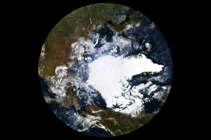
During the summer minimum, the North polar ice cap looked like this:

Arctic sea ice from September 18 – 24, 2018, image from MODIS

The sea ice extent today:

Why does anyone listen to Al Gore ?

The Point of No Return (Again and Again)

Have you noticed something missing this year? No? Each time just before these conferences happen the World Meteorological Organisation normally pronounces that the current year will be the hottest or second hottest on record, often weeks before the end of the year. Then when the figures are actually collated and published well after the climate scare conference, a quiet retraction is published that says “We didn’t quite lie, but it wasn’t exactly true.” Maybe it’s because nobody’s listening any more, except the ABC.

Tim Blair on the religion of “Point of No Return”

It’s that time of year again when we join with friends and family to celebrate the annual Point of No Return religious festival.

On Sunday morning hundreds of politicians, government officials and scientists will gather in the grandeur of the International Congress Centre in Katowice, Poland.

It will be a familiar experience for many. For 24 years the annual UN climate conference has served up a reliable diet of rhetoric, backroom talks and dramatic last-minute deals aimed at halting global warming.

But this year’s will be a grimmer affair – by far. As recent reports have made clear, the world may no longer be hovering at the edge of destruction but has probably staggered beyond a crucial point of no return.

Hooray! This fine tradition truly unites all people and cultures in a spirit of holy panic and demands for cash prizes. Let’s take a look at how the world marked the Point of No Return in years past:

2017:

We’re Now Even Closer to the Point of No Return

2016:

Climate change escalating so fast it is ‘beyond point of no return’

2015:

Climate Change Goes Past Point Of No Return

2014:

Passing the “Point of No Return” on Climate Change

2013:

The Fast-Approaching ‘Point of No Return’ for Climate Change

2012:

Warming nears point of no return, scientists say

2011:

When do we hit the point of no return for climate change?

 Embedded video

BBC News (World)

@BBCWorld

 “We’re facing a man-made disaster of global scale… time is running out” – Sir David Attenborough issues warning at UN Climate Conference #COP24 in Poland http://bbc.in/2Pd3yfP 

We are passing the point of no return on climate change

2009:

Climate Change: The Point of No Return

2008:

ARCTIC: POINT OF NO RETURN?

2007:

Beyond the Point of No Return: It’s too late to stop climate change – so what do we do now?

2006:

Environment in crisis: ‘We are past the point of no return’

2005:

Climate’s Point of No Return

2004:

Is Greenland Ice Sheet passing “Point of No Return”?

2003:

Beyond these temperature thresholds, evidence suggests a ‘point of no return’,

It’s quite mild here in Sydney today, by the way. How’s the end of the world going in your neighbourhood?

Read the full article here

So What Was The Perfect Pre-Industrial Global Temperature?

According to the Climate Change Alarmism crowd the earth was once perfect in every way, then we started to use fossil fuels. We don’t have enough actual temperature measurements from back then so to find out what it was like in 1850 you can use the climate models to “hindcast” the temperatures. Yes, those same models that failed to forecast the 20 year pause.

And here we are spending trillions of dollars to fight a problem we can’t actually measure or define.

From “Watts Up With That”

What Was Earth’s Preindustrial Global Mean Surface Temperature, In Absolute Terms Not Anomalies, Supposed to Be?

And What Have the Average Temperatures of Earth’s Surfaces Been Recently in Absolute Terms, Not Anomalies?

The answers may surprise you.

THIS POST HAS BEEN UPDATED. The update is near the end of the post.

Recently, the Intergovernmental Panel on Climate Change (IPCC) and the U.S. Global Change Research Program (USGCRP) have cranked up their alarmist propaganda, with the IPCC now pushing the goal of limiting global warming to 1.5 deg C above preindustrial global surface temperatures.

That, of course, initiates the title question, What Was Earth’s Preindustrial Global Mean Surface Temperature, In Absolute Terms Not Anomalies, Supposed to Be?

Four years ago, in the post On the Elusive Absolute Global Mean Surface Temperature – A Model-Data Comparison (WattsUpWithThat cross post is here), we illustrated and discussed the wide (3-deg C) span in the climate model simulations of global surface temperatures on an absolute, not anomaly, basis. Figure 1 below is Figure 5 from that post. In that post, we started the graphs in the year 1880 because the GISS Land-Ocean Temperature Index (LOTI) and NOAA NCDC (now NOAA NCEI) data started that year.

Figure 1

However, the spreadsheets I prepared for that post had the climate model hindcast outputs as far back as their common start year of 1861. (I say common start year of 1861 because the outputs of some models stored in the CMIP5 archive start in 1850 while others begin in 1861.) So I couldn’t use the climate model outputs stored on that spreadsheet for this post.

Note: The IPCC’s new definition of preindustrial, as stated in their Changes to the Underlying Scientific-Technical Assessment to ensure consistency with the approved Summary for Policymakers:

The reference period 1850-1900 is used to approximate pre-industrial global mean surface temperature (GMST).

It’s odd that the IPCC selected those years when not all the climate models used in their 5th assessment report (those stored in the CMIP5 archive) for simulations of past and future climates extend back to 1850. Some only extended back to 1861. Then again, no one expects the IPCC to be logical because they’re a political, not scientific, entity.

Luckily, the ensemble members that meet the criteria of this post do extend back to 1850. So we’ll use the ensemble member outputs for the full IPCC-defined preindustrial period of 1850 to 1900 for this post.

ACCORDING TO THE CMIP5-ARCHIVED CLIMATE MODELS THERE’S A WIDE RANGE OF SIMULATED PREINDUSTRIAL GLOBAL MEAN SURFACE TEMPERATURES

The source of the outputs of the climate model simulations of global mean surface temperature used in this post is the KNMI Climate Explorer. Specifically, as a pre-qualifier, I used the outputs of the simulations of Surface Air Temperatures (TAS) from 90S-90N from the 81 individual ensemble members. From those, I identified the ensemble member with the warmest global mean surface temperature for the preindustrial period and the ensemble member with the coolest global mean surface temperature for the same period. For those who wish to confirm my results, the coolest (lowest average absolute GMST for the period of 1850-1900) is identified as IPSL-CM5A-LR EM-3 at the KNMI Climate Explorer, and the warmest (highest average absolute GMST for the period of 1850-1900) is identified there as GISS-E2-H p3. The average global mean surface temperatures for the other 79 ensemble members during preindustrial times rest between the averages of the two ensemble members.

The outputs of the simulations of global mean surface temperature from those two (the warmest and coolest absolute temperatures) ensemble members for the preindustrial period of 1850-1900 are illustrated in Figure 2, along with their respective period-average global mean surface temperatures for the IPCC-defined preindustrial period of 1850 to 1900 (dashed lines).

Figure 2

As noted at the bottom of the illustration, The Scientists Behind the CMIP5-Archived Models (Used By the IPCC for AR5) Obviously Believe Earth’s Preindustrial Average Surface Temperature Should Be Somewhere Between 12.0 Deg C and 15.0 Deg C. The modelers at the Goddard Institute for Space Studies (GISS) and at the Institut Pierre-Simon Laplace (IPSL) would NOT have archived those models if they hadn’t believed they were of value.

Read the rest of the article here

Jo Nova: Wind Turbines New Apex Predator

Everything that the environmentalists and Greens demand that we have to do to “save the environment” just does the opposite.

From joannenovaova.com.au

Wind Turbines are new top predator in the ecosystem

Wind turbines either kill or scare away three quarters of buzzards, hawks and kites at three sites in India. That makes them the new “top predator” in the ecosystem according to new research.  Perhaps not the niche that Greens were expecting wind farms to occupy.

It’s not all bad news though, fan-throated lizards are pretty happy about not being dinner.

h/t GWPF

75% of Buzzards Vote For Coal Power

Lizards vote for wind.

Wind farms are the ‘new apex predators’: Blades kill off 75% of buzzards, hawks and kites that live nearby, study shows

Harry Pettit for Daily Mail Online

  • Predatory bird numbers are four times higher in areas away from wind turbines
  • This is having a devastating ’ripple effect’ across the food chain
  • It means numbers of certain small animals are growing unchecked

Wind turbines are the world’s new ‘apex predators’, wiping out buzzards, hawks and other carnivorous birds at the top of the food chain, say scientists. A study of wind farms in India found that predatory bird numbers drop by three quarters in areas around the turbines. This is having a ‘ripple effect’ across the food chain, with small mammals and reptiles adjusting their behaviour as their natural predators disappear from the skies.

Study coauthor Professor Maria Thaker said:
‘Every time a top predator is removed or added, unexpected effects trickle through the ecosystem. What is actually happening here is the wind-turbines are akin to adding a top predator to the ecosystem.’

From the abstract:

The cascading effects of wind turbines on lizards include changes in behaviour, physiology and morphology that reflect a combination of predator release and density-dependent competition. By adding an effective trophic level to the top of food webs, we find that wind farms have emerging impacts that are greatly underestimated. There is thus a strong need for an ecosystem-wide view when aligning green-energy goals with environment protection.

300,000 wind turbines too late.

Paul Homewood: Why The Weather Doomsayers Need To Take A Raincheck

In Australia we only have about 100 years of weather data, but in the UK they have about 250 years of reliable measurements. So if global warming were a thing it should be apparent there. If extreme weather events were becoming more frequent as we are regularly assured by celebrity scientists, movie stars and politicians, you would see a trend in the UK wouldn’t you? Apparently not.

From Watts Up With That:

Why The Weather Doomsayers Need To Take A Raincheck

Recent UK climate trends offer absolutely no support for outlandish forecasts, which are of course the product of those computer models we hear so much about.

by Paul Homewood

How often do we hear claims that British weather is getting more extreme? Whether it’s heatwaves, droughts, rain or storms, it’s always ‘worse than it used to be’. We even had David Cameron saying that the winter floods of 2014 were linked to climate change. And it is not just laymen who make claims like these, but climate scientists. It does not help, of course, that we tend to have selective memories about the past.

However a new study by the Global Warming Policy Foundation has closely examined official Met Office data and found that such claims are baseless. In reality, apart from the fact that it is slightly warmer than a century ago, the UK climate has changed remarkably little during that time.

In particular, the report – Defra Versus Met Office: Fact-checking the State of the UK Climate  – finds that:

  • Heatwaves have been much less intense in the last decade than before, with no summer comparable to the heat of 1976 since then. (See Fig 1)
  • There has been a marked reduction in the number of extremely cold days in the last three decades.
  • Apart from Scotland, where rainfall has been increasing in recent years, there has been little long-term trend in precipitation. (See Fig 2)
  • In particular, winters are no wetter than they used to be in England and Wales, and summers no drier, contrary to popular myth.
  • Rainfall has also not become more extreme. The wettest year since records started in 1766 was 1872, followed by 1768. The wettest decade was the 1870s, and the wettest month was October 1903.
  • Droughts are also not becoming more common or severe.


Figure 1: Distribution of extreme temperatures in Central England Temperature Record

(a) days over 30C; (b) days under -10C

Fig 2 : Long Term Precipitation Record for England & Wales

In recent years the Met Office has taken great delight in naming all storms, although most of these have not technically reached storm force. In reality, as their own figures show, storms have not got any worse in the last four decades.

And despite misinformation to the contrary, sea levels around our coasts are rising only very slowly, and at a similar rate to the early 20th century.

What about temperatures? The data shows that there was a steady rise during the 1990s and early 2000s, but that this rise has since petered out and average temperatures levelled off. There was a very similar increase in temperatures in the early 18th century.

Even this summer was not a record-breaker. According to the long-running Central England Temperature series, it was only the fifth-warmest, and not even as hot as the summer of 1826.

The British climate has always been notable for its volatility, with big swings in weather from week to week, month to month, and year to year. This variability swamps whatever underlying trends there may be. But what we do know is that whatever weather we get now, we have had in the past.

Full story here


The Straw Man Argument

With the latest environmental hysteria gaining traction to ban plastic straws (as usual both irrational and unscientific) here is a graph that puts Australia’s plastic pollution in perspective:

Yeah, we don’t even make the top 12.

You may have also heard about the incredible figure of 500 million plastic straws used by Americans every day. It turns out that came from a science project by a 9 year old boy. That doesn’t prove it is wrong, just lacking in academic rigour because most 9 year olds have not been trained in the scientific method (much like most adult environmentalists)

It’s Colder Than We Thought

Amidst all the hype about global warming that continues amidst 20 years of no change in temperature, scientists have found that some places are colder than we could imagine.

In Antarctica scientists have measured the lowest temperature yet recorded on the planet. -98C which is down 5 degrees from the previously measured record of -93. To get that low, clear skies and low humidity must persist several days. 

It is believed that it is theoretically possible for temperatures to go to -100C.

So the next time the ABC tells us Antarctica is melting, remember that this is not the full story, and that it is still a very very cold place.

Read the full article here

Jo Nova On Warming In The Antarctic

You may have head on the ABC about how the Antarctic is losing its ice cover and one day will be ice free. Scientist Jo Nova puts that into context

Antarctic Ice Loss Tripled, from near zero to an extremely tiny number! (Nobody mention those volcanoes)

Quick — tax the magma

It’s another round of Antarctic Doom about next to nothing. In April Antarctica’s ice was melting five times faster than usual. Now it’s losing ice three times faster in the last five years than the 15 before that! What you won’t hear is how the Antarctic ice cap has 29 million cubic kilometers of ice and has been there for 30 million, mostly warmer, years. You also won’t hear how Antarctica was warmer in Roman Times, or that the  Antarctic Peninsula has cooled by almost 1 degree.

You also won’t hear a word about any volcanoes

The new paper has zero mentions of the word. But other scientists have published plenty of papers describing how the West Antarctic zone is being warmed from below by 1200 degrees of magma. According to scientist Dustin Schroeder and co,  it is as if the Thwaites Glacier in West Antarctic is sitting on a “stovetop burner”.[1]  His words. Thwaites Glacier,, smack in the middle of the warming is being melted from below by geothermal heat. Then there is the large blob of superheated rock 60 miles below West Antarctica. The researchers use the phrase “like a blow-torch”….  Capping it off, only last year 91 new volcanoes were discovered 2km underneath the West Antarctic Rift. That’s new, as in, we didn’t know they were there.

Follow the reasoning, either a trace gas 10 kilometers up is causing some spots of Antarctica to warm and other parts to cool, or hot magma at 1,200C is. What’s more likely?

Antarctic ice, warming, melting, map, graphic, location of volcanoes, geothermal heat.

Antarctic ice is warming in West Antarctica and the Peninsula, but not over most of East Antarctica.


From the new paper we get the same old pattern. The biggest part of Antarctica is East Antarctica and it’s not melting — even in this alarming new paper.

I thought there was CO2 there as well?

Antarctic Melting, 2018. Graph

The battle of Big Meaningless Numbers

From the abstract we find tiny fractions are written up as big numbers of small units with no real context. Then they extrapolate a 6 year trend on an ice mass that’s been around for millions of years.  Adding up the losses, in this “worst of the worst” scenarios Antarctica might be losing 187 billion tonnes of ice per year (give or take a lot). That’s 187 cubic kilometers of ice, which sounds like a lot until we look at the size of the Antarctic Ice Sheet (29 million kilometers cubed). At this new “accelerated” rate the total loss is one 155,00oth of the total mass. Expressed another way, it’s 0.0006%. At this rate Antarctica will be entirely melted 155,000 years from now.

This agrees quite well with the April round of Antarctic Doom which implied it would melt in 118,000 years. Lucky us, we have 30,000 years to spare now.

The first line in the paper’s introduction:

“The ice sheets of Antarctica hold enough water to raise global sea level by 58m.”

Handy to know what people in 155,000 A.D. will be facing. Now that’s forward planning….

Facts Overcome Fear-Mongering

As the fear campaign against CSG ramps up, a few facts from the U.S. moght help counter the nonsense, or maybe not.

From Wattsupwiththat.com

America! Frac Yeah!

Guest commentary by David Middleton

By Hank Campbell — May 18, 2018

In 2009 the U.S. government attended the United Nations Climate Change Conference in Copenhagen and pledged to reduce overall greenhouse gas emissions 17 percent by 2020.

To make it happen, the Obama administration directed the U.S. Environmental Protection Agency to lead the way starting with carbon dioxide (CO2) and that resulted in the Clean Power Plan (CPP) in 2015. While the goal was laudable, no one is in favor of more pollution, it was a blunt instrument because it unfairly penalized fossil fuel power plants…

[…]

The Paris Agreement is now gone in America, what federal politicization of science giveth politicization of science can taketh away, but the emissions reductions the government sought still happened despite a lack of regulations and for that we can thank American science and technology.

Though the added regulations have not come to pass, that’s been a good thing. Without onerous cost increases on the poor, built-in higher rates due to solar and wind programs aside, the free market has continued to cause CO2 emissions to plummet, so much so that in 2017 America reached the CPP’s desired 2025 targetThat’s not due to solar or wind, finds the study in Environmental Science & Technology, it is overwhelmingly due to natural gas. Thanks to modern natural gas extraction techniques such as hydraulic fracturing…

[…]

co220emissions

[…]

If the federal government stays out of picking winners and losers in energy, the trend toward lower emissions is likely to continue.

[…]

That’s something we can all cheer.

[…]

American Council on Science and Health

Frac’ing A Bubba!

Hank Campbell is the antithesis of Chris Mooney.

And… From the No Schist Sherlock files…

UC study finds no evidence of drinking water contamination from fracking

The three-year study found no relationship between methane concentrations in groundwater and proximity to natural gas wells.

By Michael Miller

May 18, 2018

A study of drinking water in Appalachian Ohio found no evidence of natural gas contamination from recent oil and gas drilling.

Geologists with the University of Cincinnati examined drinking water in Carroll, Stark and Harrison counties, a rural region in northeast Ohio where many residents rely on water from private underground wells.

The time-series study was the first of its kind in Ohio to examine methane in groundwater in relation to natural gas drilling. The results were published in the journal Environmental Monitoring and Assessment.

“Some people had elevated concentrations of methane in their groundwater, but the isotopic composition showed it wasn’t from natural gas” said Amy Townsend-Small, associate professor of geology in UC’s McMicken College of Arts and Sciences.

“What we found is in most cases it was probably from underground coal in the area or biological methane produced in groundwater.”

[…]

They found no increase in methane concentration or composition in groundwater over the four years of the study, despite the presence of new shale gas wells drilled in the study area. Likewise, they did not find higher methane levels in closer approximation to shale drilling.

Researchers did find wide variability in methane concentrations in the drinking water, ranging from 0.2 micrograms per liter to 25.3 milligrams per liter, which is strong enough to catch fire in enclosed spaces. But researchers found no relationship between the methane observed in drinking water and the new gas wells.

[…]

“Some people had elevated concentrations of methane in their groundwater, but the isotopic composition showed it wasn’t from natural gas. It was from a different source,” Townsend-Small said. “What we found is in most cases it was probably from underground coal in the area or biological methane produced in groundwater.”

[…]

University of Cincinnati

This should come as no surprise… As hard as the Obama maladministration EPA tried, they couldn’t find a single specific incident in which frac’ing was related to water pollution.

Apart from Gasland-style lies, there is no evidence of frac’ing polluting groundwater/

COLORADO FLAMING FAUCET NATURALLY OCCURRING METHANE

Locally, in Fort Lupton, CO, the film shows a resident igniting his tap water, leaving the impression that the flaming tap water is a result of natural gas drilling. However, according to the Colorado Oil and Gas Conservation Commission (COGCC), which tested this resident‟s water in 2008, at his request,: “Dissolved methane in well water appears to be biogenic [naturally occurring] in origin. …There are no indications of oil & gas related impacts to water well.”(COGCC 9/30/08). This means that the natural gas in the resident‟s well water is of recent bacterial origin, which could result from the poor well completion and hygiene, or penetration of shallow coal seams. The film‟s implication that natural gas production and hydraulic fracturing are to blame is blatantly false.

COGA