So What Was The Perfect Pre-Industrial Global Temperature?

According to the Climate Change Alarmism crowd the earth was once perfect in every way, then we started to use fossil fuels. We don’t have enough actual temperature measurements from back then so to find out what it was like in 1850 you can use the climate models to “hindcast” the temperatures. Yes, those same models that failed to forecast the 20 year pause.

And here we are spending trillions of dollars to fight a problem we can’t actually measure or define.

From “Watts Up With That”

What Was Earth’s Preindustrial Global Mean Surface Temperature, In Absolute Terms Not Anomalies, Supposed to Be?

And What Have the Average Temperatures of Earth’s Surfaces Been Recently in Absolute Terms, Not Anomalies?

The answers may surprise you.

THIS POST HAS BEEN UPDATED. The update is near the end of the post.

Recently, the Intergovernmental Panel on Climate Change (IPCC) and the U.S. Global Change Research Program (USGCRP) have cranked up their alarmist propaganda, with the IPCC now pushing the goal of limiting global warming to 1.5 deg C above preindustrial global surface temperatures.

That, of course, initiates the title question, What Was Earth’s Preindustrial Global Mean Surface Temperature, In Absolute Terms Not Anomalies, Supposed to Be?

Four years ago, in the post On the Elusive Absolute Global Mean Surface Temperature – A Model-Data Comparison (WattsUpWithThat cross post is here), we illustrated and discussed the wide (3-deg C) span in the climate model simulations of global surface temperatures on an absolute, not anomaly, basis. Figure 1 below is Figure 5 from that post. In that post, we started the graphs in the year 1880 because the GISS Land-Ocean Temperature Index (LOTI) and NOAA NCDC (now NOAA NCEI) data started that year.
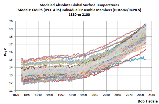
Figure 1

However, the spreadsheets I prepared for that post had the climate model hindcast outputs as far back as their common start year of 1861. (I say common start year of 1861 because the outputs of some models stored in the CMIP5 archive start in 1850 while others begin in 1861.) So I couldn’t use the climate model outputs stored on that spreadsheet for this post.

Note: The IPCC’s new definition of preindustrial, as stated in their Changes to the Underlying Scientific-Technical Assessment to ensure consistency with the approved Summary for Policymakers:

The reference period 1850-1900 is used to approximate pre-industrial global mean surface temperature (GMST).

It’s odd that the IPCC selected those years when not all the climate models used in their 5th assessment report (those stored in the CMIP5 archive) for simulations of past and future climates extend back to 1850. Some only extended back to 1861. Then again, no one expects the IPCC to be logical because they’re a political, not scientific, entity.

Luckily, the ensemble members that meet the criteria of this post do extend back to 1850. So we’ll use the ensemble member outputs for the full IPCC-defined preindustrial period of 1850 to 1900 for this post.

ACCORDING TO THE CMIP5-ARCHIVED CLIMATE MODELS THERE’S A WIDE RANGE OF SIMULATED PREINDUSTRIAL GLOBAL MEAN SURFACE TEMPERATURES

The source of the outputs of the climate model simulations of global mean surface temperature used in this post is the KNMI Climate Explorer. Specifically, as a pre-qualifier, I used the outputs of the simulations of Surface Air Temperatures (TAS) from 90S-90N from the 81 individual ensemble members. From those, I identified the ensemble member with the warmest global mean surface temperature for the preindustrial period and the ensemble member with the coolest global mean surface temperature for the same period. For those who wish to confirm my results, the coolest (lowest average absolute GMST for the period of 1850-1900) is identified as IPSL-CM5A-LR EM-3 at the KNMI Climate Explorer, and the warmest (highest average absolute GMST for the period of 1850-1900) is identified there as GISS-E2-H p3. The average global mean surface temperatures for the other 79 ensemble members during preindustrial times rest between the averages of the two ensemble members.

The outputs of the simulations of global mean surface temperature from those two (the warmest and coolest absolute temperatures) ensemble members for the preindustrial period of 1850-1900 are illustrated in Figure 2, along with their respective period-average global mean surface temperatures for the IPCC-defined preindustrial period of 1850 to 1900 (dashed lines).
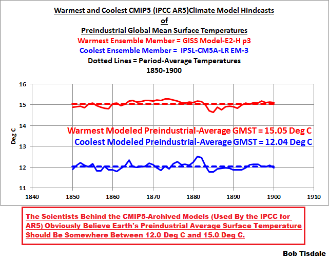
Figure 2

As noted at the bottom of the illustration, The Scientists Behind the CMIP5-Archived Models (Used By the IPCC for AR5) Obviously Believe Earth’s Preindustrial Average Surface Temperature Should Be Somewhere Between 12.0 Deg C and 15.0 Deg C. The modelers at the Goddard Institute for Space Studies (GISS) and at the Institut Pierre-Simon Laplace (IPSL) would NOT have archived those models if they hadn’t believed they were of value.

Read the rest of the article here

Paul Homewood: Why The Weather Doomsayers Need To Take A Raincheck

In Australia we only have about 100 years of weather data, but in the UK they have about 250 years of reliable measurements. So if global warming were a thing it should be apparent there. If extreme weather events were becoming more frequent as we are regularly assured by celebrity scientists, movie stars and politicians, you would see a trend in the UK wouldn’t you? Apparently not.

From Watts Up With That:

Why The Weather Doomsayers Need To Take A Raincheck

Recent UK climate trends offer absolutely no support for outlandish forecasts, which are of course the product of those computer models we hear so much about.

by Paul Homewood

How often do we hear claims that British weather is getting more extreme? Whether it’s heatwaves, droughts, rain or storms, it’s always ‘worse than it used to be’. We even had David Cameron saying that the winter floods of 2014 were linked to climate change. And it is not just laymen who make claims like these, but climate scientists. It does not help, of course, that we tend to have selective memories about the past.

However a new study by the Global Warming Policy Foundation has closely examined official Met Office data and found that such claims are baseless. In reality, apart from the fact that it is slightly warmer than a century ago, the UK climate has changed remarkably little during that time.

In particular, the report – Defra Versus Met Office: Fact-checking the State of the UK Climate  – finds that:

  • Heatwaves have been much less intense in the last decade than before, with no summer comparable to the heat of 1976 since then. (See Fig 1)
  • There has been a marked reduction in the number of extremely cold days in the last three decades.
  • Apart from Scotland, where rainfall has been increasing in recent years, there has been little long-term trend in precipitation. (See Fig 2)
  • In particular, winters are no wetter than they used to be in England and Wales, and summers no drier, contrary to popular myth.
  • Rainfall has also not become more extreme. The wettest year since records started in 1766 was 1872, followed by 1768. The wettest decade was the 1870s, and the wettest month was October 1903.
  • Droughts are also not becoming more common or severe.


Figure 1: Distribution of extreme temperatures in Central England Temperature Record

(a) days over 30C; (b) days under -10C

Fig 2 : Long Term Precipitation Record for England & Wales

In recent years the Met Office has taken great delight in naming all storms, although most of these have not technically reached storm force. In reality, as their own figures show, storms have not got any worse in the last four decades.

And despite misinformation to the contrary, sea levels around our coasts are rising only very slowly, and at a similar rate to the early 20th century.

What about temperatures? The data shows that there was a steady rise during the 1990s and early 2000s, but that this rise has since petered out and average temperatures levelled off. There was a very similar increase in temperatures in the early 18th century.

Even this summer was not a record-breaker. According to the long-running Central England Temperature series, it was only the fifth-warmest, and not even as hot as the summer of 1826.

The British climate has always been notable for its volatility, with big swings in weather from week to week, month to month, and year to year. This variability swamps whatever underlying trends there may be. But what we do know is that whatever weather we get now, we have had in the past.

Full story here


Global Warming And Malaria

From Watts Up With That


Remember when global warming was going to increase Malaria? Never mind…

Remember these claims?

From Our World in Data, over the past 15 years, malaria deaths have almost halved. (h/t to Bjorn Lomborg)

In the visualisations below we provide estimates of the total number of deaths from the World Health Organization (WHO) from 2000 to 2015, and the Institute of Health Metrics and Evaluation (IHME), Global Burden of Disease (GBD) from 1990 to 2016. These estimates are notably different across various countries which affects the total number of reported deaths. IHME figures, as shown below, tend to be higher; they report deaths greater than 720,000 in 2015 versus only 438,000 from the WHO. Further information on the confidence intervals of WHO estimates, and a country-level comparison between these two sources is covered in our section on Data Quality & Definitions.

Malaria death estimates from WHO

Since the beginning of the 21st century, the WHO has published global estimates of the number of people that die from malaria. In these 15 years the global death toll has been cut in half: from 839,000 deaths in 2000 to 438,000 in 2015.

Click here for the rest of the article


I Like Turtles


turtle

A great journalistic triumph on the ABC this morning was the report on the all female hatching of green sea turtles at the northern end of the Barrier Reef. The study was funded by US weather agency NOAA , the Australian Government and WWF (the World Wildlife Fund), a notorious pusher for climate change propaganda. The research was carried out by scientists (I would use that word cautiously) from James Cook University, another institution devoted to the climate religion.

Anyway, using DNA samples from turtles in the wild they were able to trace where they hatched from and deduced that all turtles from the northern end of the reef born last year were female. We know that the warmer the environment the more likely the hatchlings are to be female.

The journalist asked a very wise question, “How much have temperatures here increased?”

There was a pause while the scientist was obviously thinking “Crap! We haven’t thought this through.” Eventually she said “We know that the average global temperatures have increased by 0.8 degrees since the 1880’s and we need to do more to fight climate change.”

We don’t know how the temperatures have changed at the place where the turtles are hatching, but they are obviously under threat because temperatures in other paces have increased a little since the Little Ice Age.

Being the modern journalist at the ABC, there was no pressing of the point.

Also I was intrigued by other questions that were not asked like:

  • How are the turtles at the other breeding sites doing? Are they producing males who then mix in with the wider population?
  • What role does habitat destruction play in the health or otherwise of the turtle population?
  • Since they were only measuring older turtles and working backwards, is it possible that there were in fact many males produced but something other than slightly higher temperatures was killing them?
  • Is it possible that the last two years of warmer than average temperatures were caused by something other than “climate change”?
  • If we stopped all CO2 production tomorrow would the turtles notice the supposed change in temperature?
  • How did the sea turtles survive the Medieval and Roman Warm Periods, not to mention other geological periods when temperatures were much higher?

Here is the problem for environmentalists. If you think that climate change explains everything that is bad in nature, then if there are other causes for bad outcomes focusing on “fixing” the climate will kill the very things you are trying to save.

What a pity we can’t get proper journalists and scientists to ask the necessary questions.

Plants Responsible for 11 Times More CO2 in the Atmosphere Than People

In a rational science-based world this would be the end of the Great Climate Change Scare. If plants produce 11 times as much CO2 as human activity, and if CO2 is the main driver of climate change then really anything we do is minor compared to the natural inputs.

In a rational world the huge subsidies paid to solar and wind power producers would end, and with them the crazy electricity prices destroying industry and employment in many Western countries.

In a rational world politicians and journalists would be reading this article and joining the dots.

From, of all places, the ABC:

Plants release up to 30 per cent more CO2 than previously thought, study says

Updated 

While much focus is placed on human-caused emissions of carbon dioxide into the atmosphere, research from teams around the world suggests plants could be contributing up to 11 times as much.

A study involving the Australian National University, Western Sydney University, and centres around the world has found plants release more carbon dioxide through their respiration than previously thought.

And what is more, as global temperatures rise, scientists say the output of carbon dioxide by plants will accelerate.

During daylight hours, plants take in carbon dioxide and release oxygen through photosynthesis, however plants also release carbon dioxide through respiration.

ANU researcher Owen Atkin said plant respiration was previously thought to account for five to eight times the carbon compared to human activity.

However the new findings suggested that number could be much higher.

“Each year the burning of fossil fuels releases around 5 to 8 billion tons of carbon … so the respiration by plants is somewhere approaching 11 times that in our new estimate,” he said.

“That’s an enormous flux.

“What will happen in the future will be that those rates of carbon released by plants will increase as the world gets warmer, and it will have an impact on how much carbon is stored in vegetation, how much accumulates in the atmosphere in the future.”

The study examined about 1,000 plant species in a range of climate extremes, to determine how much carbon dioxide is released in various scenarios.

“This will have fairly substantial implications for our ability to model carbon flows between landscapes and the atmosphere, and ultimately how much carbon dioxide accumulates in the atmosphere,” Professor Atkin said.

Researchers said plants could also see a declining ability to absorb carbon dioxide currently in the atmosphere through photosynthesis, and that carbon flow models and budget projections would need to be altered in response to the findings.

I just love the weasel word “could” in that final paragraph. It also overlooks the fact that the world is greening in response to higher CO2 levels.


When Green Policies Fail (Nearly Always)

The unrelenting push for so-called renewable energy to replace coal in order to save the planet has its collateral damage. If you push up the price of electricity to make renewables competitive and decrease overall usage then people are going to find that alternatives become economically feasible- like ditching grid power for diesel generators. That’s got to be a win for the environment.

Jo Nova writes:

Some South Australian farmers going fully diesel for electricity

Diesel generator.  Coupole d'Helfaut in 1944,

Maybe they’ll get one like this one? ;-) Circa 1934.*

Green management of the South Australian grid scores another big success for the environment:

The Manns’ electricity costs have more than doubled in five years, from about $200,000 per annum to $500,000.

Due to the high prices, the family will this summer switch to diesel power to run their 116-stand rotary dairy and 14 irrigation centre pivots at Wye in the lower south east of South Australia.

The Manns are among Australia’s top 10 dairy producers, in terms of volume, milking up to 2300 cows and producing 19-21 million litres annually.

If only South Australia had more “cheap” solar and wind power, their electricity might be as low cost as the coal-fired Victorians:

Their move comes as South Australia’s dairy lobby has calculated the state’s dairy farmers paid about 40 per cent more for power than their Victorian neighbours last season.

The Mann’s are definitely going diesel this summer, but may set up a mixed solar-diesel-battery plan in the long run:

“Its embryonic, but information we have is saying we could get a payback within five years of (setting up a system on-farm) not connected to the grid, a combination of solar, diesel and batteries.

Imagine how expensive your electricity has to be for a small diesel generator to be cheaper than mass produced coal power? This could be the first time in 130 years that people connected to coal turbines switch off to use their own small fossil fueled generators because it’s cheaper.

Another world first for South Australia. And possibly a mark of the grid saturation point of intermittent renewables.

WORLD ENDS? WELL IT MAY TAKE A BIT LONGER NOW… Melanie Phillips

Melanie Phillips writes that the  climate “scientists” are startnig to admit that the computer models might be running “on the hot side” and we may have a bit longer to repent of our sins against  Gaia.
So the long walk-back from the doom merchandising begins. It will take a few more years and a few more trillion dollars thrown into emissions reduction and expensive renewable energy, but our politicians (except the Greens of course who are the thickest of the lot) will eventually wake up to the con.
The tragedy of lives lost by people who could not afford to heat or cool their homes, the jobs lost in manufacturing industries, the hospitals and schools that could have been funded on money diverted is all incalculable.
climate-activists

WORLD ENDS? WELL IT MAY TAKE A BIT LONGER NOW…

Climate scientists have now admitted they were wrong about man-made global warming and I don’t know whether to laugh or cry.

Not very wrong, you understand, just a bit wrong. Apparently the planet is still going to hell in a carbon-lined hand-cart, just more slowly.

A study in the journal Nature Geoscience says the world has warmed more slowly than had been forecast by computer models, which were “on the hot side” and overstated the impact of emissions. You don’t say.

Global average temperature has risen by about 0.9C since pre-industrial times but there was a slowdown in the rate of warming for 15 years before 2014.

Er, would that be the slowdown that was authoritatively said not to have happened because the computer models all said it was impossible for it to happen, because everyone knew that rising CO2 levels inescapably caused global temperatures to rise and anyone who said the evidence of the slowdown showed the entire theory was bunkum and hogwash was a “denier”?

Yes, it would.

The Times reports:

“Myles Allen, professor of geosystem science at the University of Oxford and another author, said: ‘We haven’t seen that rapid acceleration in warming after 2000 that we see in the models. We haven’t seen that in the observations.’

“He added that the group of about a dozen computer models, produced by government institutes and universities around the world, had been assembled a decade ago ‘so it’s not that surprising that it’s starting to divert a little bit from observations’. Too many of the models used ‘were on the hot side’, meaning they forecast too much warming.”

Nevertheless, according to the study rapid reductions in emissions will still be required – but the world now has more time to make the changes.

But if the computer models were wrong, on what evidence do these scientists base any calculation of what reductions in emissions will be required? On what basis do they still maintain there is a need for any reductions at all?

According to Myles Allen, the group of about a dozen computer models, produced by government institutes and universities around the world, had been assembled a decade ago “so it’s not that surprising that it’s starting to divert a little bit from observations”.

Oh really? Why isn’t it surprising? The theory hasn’t changed: you know, the theory – sorry, not a theory but the unchallengeable and incontrovertible and inconvenient truth – that rising CO2 levels cause a rise in global temperature.

So what exactly was it that had been fed into the computer models a decade ago that caused them to fail to predict that rising CO2 levels would not continue to cause such a rise in global temperature – or to be more precise, that they would cause a slowdown for a few years? Does the theory itself have a break for R&R? Because such a slowdown was certainly not included in the catechism of anthropogenic global warming theory.

Well, it was just those darned pesky computers that screwed up, wasn’t it, and led those scientists astray. Not the scientists’ fault at all, was it.

The truth is rather different. As many of us have been saying since AGW theory was first invented in 1988, the idea that computer modelling could ever predict something as stupendously complex as climate change was always scientifically illiterate. Computers are only as good as the information that is fed into them. If you feed rubbish in, you get rubbish out. Fed inadequate information designed to prove AGW theory, the computers disgorged predictions that proved AGW theory.

The whole thing was a scam from start to finish. Will these Potemkin scientists ever admit that? Even now the Met Office, among others, is still trying to spin the data, as David Whitehouse reports here.

For the past three decades, AGW zealots have insisted that “the science is settled” (itself another piece of anti-science illiteracy). They not only denounced as “deniers” those who actually looked at the evidence and questioned the theory but also sought to ruin their reputations and careers.

Climate-related science has been corrupted by ideologically-bent grant-funding only given to projects designed to prove the theory; government policies have been catastrophically skewed to undermine energy production and screw the poor through fuel bills inflated to meet the costs dumped on energy production through an orthodoxy no-one in government had the intelligence or cojones to fight.

We have been the victims of junk science. Maybe the highly limited admission of error in this study will help blow down the whole rotten facade of pseudo-science and finally expose this charlatanry for the ideological con-trick that it is.

Jo Nova- 91 Volcanoes in Antarctica Found Under The Melting Glaciers

Who would have thought it? Volcanoes, not CO2 melting the Antarctic Ice

Jo Nova writes

Antarctica – 91 volcanoes coincidentally found under glaciers warming “due to climate change”

It’s possibly the densest concentration of volcanoes in the world, some as high as 4km and we didn’t even know these existed til recently.  Despite that overwhelming ignorance, we’re 97.00% certain that all the warming in Antarctica is due to your car and airconditioner. Robin McKie, The Guardian writer, talks about the recent discovery of so many volcanoes under the ice. Not surprisingly, we have no data on how active these volcanoes are. However because we *know* climate change is definitely wrecking Antarctica, it follows that your car, air conditioner and pet dog could melt more ice, take the pressure off the tectonic plate and set one off. Then things will really get out of hand.

Anyhow, it’s just a coincidence that all the warming in Antarctica is where the volcanoes are.

Antarctica, Warming, Climate Change, volcanoes, West Antarctic, glaciers melting.

Warming in Antarctica   |    New volcano discoveries

Spread the hagtag #allvolcanosmatter.

From The Guardian: Scientists discover 91 volcanoes below Antarctic ice sheet

Scientists have uncovered the largest volcanic region on Earth – two kilometres below the surface of the vast ice sheet that covers west Antarctica.

The project, by Edinburgh University researchers, has revealed almost 100 volcanoes – with the highest as tall as the Eiger, which stands at almost 4,000 metres in Switzerland.

Geologists say this huge region is likely to dwarf that of east Africa’s volcanic ridge, currently rated the densest concentration of volcanoes in the world.

These newly discovered volcanoes range in height from 100 to 3,850 metres. All are covered in ice, which sometimes lies in layers that are more than 4km thick in the region. These active peaks are concentrated in a region known as the west Antarctic rift system, which stretches 3,500km from Antarctica’s Ross ice shelf to the Antarctic peninsula.

Electricity Price Shock

Electricity-bill-shock-energy-cost

The brave new world of energy poverty is about to hit one of the most prosperous and energy-rich nations in the world. With electricity prices jumping by about 20% next month we are in for a tough time economically and financially. And of course the burden will as always fall hardest on the poor.

As Jo Nova points out this is how the climate change scare mongering policy is working out:

Many are blaming a “failure of energy policy”, but miss the point entirely — this is not failure but success. The aim of those energy policies was to close down coal fired stations and it worked. The Renewable Energy Target, the carbon tax, and other anti “carbon” policies did what they were supposed to do and forced the closure of both the Port Augusta power stations and Hazelwood (which supplied as much as 5% of Australia’s electricity). That left us dependent on gas instead of having the flexibility to ignore the current gas price outlandish cost.

With politicians and Chief Scientist Finkel colluding to drive up the price of electricity by forcing more renewables on us, there is no way that electricity prices are going to stabilise or fall.

At the moment, Government policy requires that retailers must take all wind and solar available at whatever price is set. Coal generators then get the left overs, but here is the rub- they cannot quickly slow down their systems (or speed them up for that matter) and coal generators run most efficiently at close to maximum power. Ironically all those wind turbines and solar cells do little to reduce the CO2 production at these plants.

So the operators of coal generators have to basically burn more coal than they optimally need to, take the price set by the Energy Market Operator and provide the “left overs” that wind and solar cannot supply on any day. Despite all the hidden subsidies in the electrical supply market, wind costs about $80 per Megawatt hour, solar $100 MWh and the wholesale price for coal is about $20 MWh.

The system is set up to destroy our cheapest form of energy generation in the long term. There will be no  more coal powered generators constructed because the current policy makes them unviable The only reason the we have any coal powered generators left in Australia is that the costs of constructing them were paid off decades ago.

Throw into that horrible mix the requirement of the Finkel review that all renewable systems must include batteries, that must surely double the cost of power generated that way- great for energy security but lousy for affordability. And then require all operators to give three years notice before exiting the industry- you have to maintain a loss-making business for three years- what planet are these people living on?

Meanwhile all of that heavy industry that used to be the life blood of Australia’s economy will go to places where electricity is cheaper- India and China most likely. Ironically the cheaper electricity in those two countries is partially fuelled by Australian coal. And of course under the Paris agreement those two countries get a free pass until 2030 from any reductions in their carbon emissions.

Australia is either being run by lunatics or traitors. I’m not sure which.